Blog
Are you ready for Mobilegeddon?
by Klevu on
On April 21, 2015 Google announced that they are boosting the ranking of mobile-friendly pages on mobile search results. As per Google Webmaster Central Blog, Search results will favor pages where “text is readable without tapping or zooming, tap targets are spaced appropriately, and the page avoids unplayable content or horizontal scrolling.” If you have responsibility for an eCommerce site and you’ve been paying attention to mobile, then this is a welcome change that will reward your efforts. If you have been putting mobile off, take notice and make mobile the priority it should be.
Shoppers want to find your mobile site
In case you need further validation for investing in your mobile-ready site, here are some proof points:
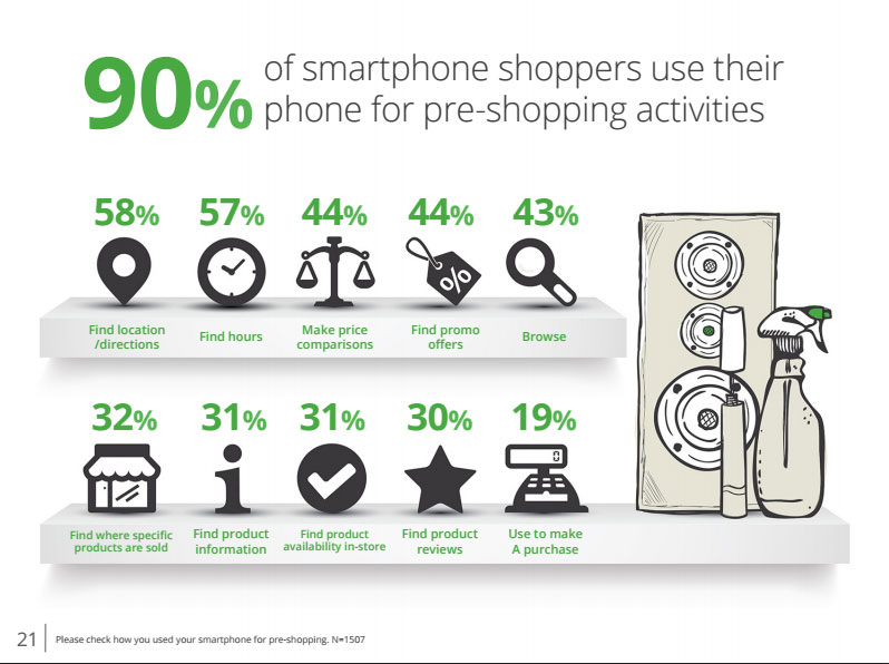
90 percent of smartphone owners use their devices for pre-shopping activities such as looking up store locations and searching for deals. Google Shopper Marketing Agency Council
More than 150 million people used a mobile device in 2014 to research, browse or compare products,including 79.0% of smartphone users and 86.0% of tablet users. eMarketer
Eighty-four percent of store visitors use their mobile devices before or during a shopping trip, including inside a brick-n-mortar location.Deloitte
While purchases made on smartphones is still relatively low (fewer than seven in 10 of mobile shoppers actually making a purchase on their device – eMarketer) research on mobile drives a lot of in-store and online purchases. If you have a site designed for mobile, the new Google mobile-friendly standards will help you get found,but what happens when shoppers get to your site? Are you prepared to draw them in and convert them?
Google Shopper Marketing Council: Mobile In-Store Research
The mobile-friendly imperative
You can make a significant difference in conversion rates and revenue by paying attention to your mobile presence:
- Design a mobile-friendly (i.e. responsively designed) website
- Test your site to ensure it’s mobile-friendly. Use the Google mobile-friendly tools: https://www.google.com/webmasters/tools/mobile-friendly/
- More testing – Avoid 404 error pages on your mobile site
- Offer mobile deals and coupons
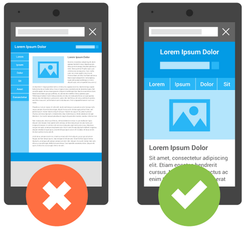
- Make sure consumers accessing your mobile site can find the products and information they are looking for
Converting the mobile window-shopper
By creating a mobile-friendly site with great content, which adheres to Google standards, you will be found. But now the real work begins. Once the consumer is on your site you need to convert them.
Klevu search can help…probably more than you think.
1. The Magic of NLP: With our patent pending technologies in Natural Language search, Klevu automatically adds relevant meta content to your product catalog. This improves product discovery tremendously, even if the keyword is not present in your product catalog. Klevu knows what shoppers are looking for on your store.
2. Klevu search term page: Klevu’s self-learning technology automatically captures popular keywords, products and queries from your search box. These terms are then added to a Google friendly search term page. The next time Google crawls your website it knows what people look for on your site. Klevu will help you stand out and get found!
3. Klevu is mobile ready and delivers completely mobile friendly search results with first-rate design layouts to choose from. Want a layout of your own? We provide an open CSS, so that you can customize the mobile layout any way you want.
4. Klevu helps consumers find all relevant content on your site – product information, reviews, company information including locations, and promotions.
A mobile-friendly site with powerful site search can be your secret weapon in increased conversion rates.
Try Klevu Pro for free with your mobile friendly site.
Related articles

Voice search is coming to e-commerce: how to prepare now and get ahead of the competition
Have you heard about the growing trend toward using personal voice assistants instead of traditional search engines? We have a new feature to prepare for the shift in format…

Benefits of Using Natural Language Processing in Ecommerce Site Search
If you are running an ecommerce business, and you’re serious about providing a flawless on-site search experience, then natural language processing (NLP) is definitely something that you should be considering.